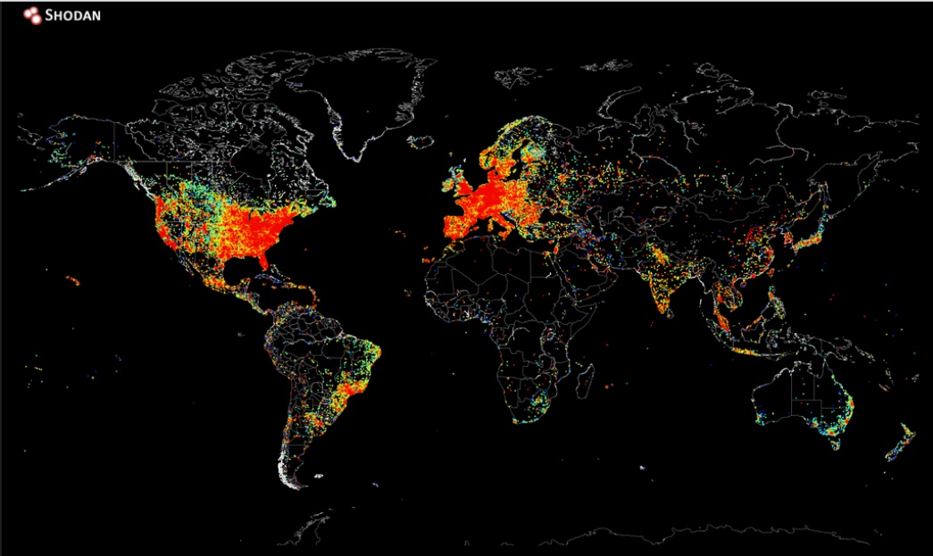
This is a wonderful idea that a map exists and it informs us about all the people in the world who are connected to the internet. The concept is called Internet cartography and we have John Matherly who has successfully drawn this interesting map referring to people connected in the internet and that is a lot informative and innovative. Location and positioning has a lot of gravitas and dignity with the advanced Global Navigation Satellite systems but this idea is completely out of the box.

On August 2, 2014 John Matherly, the founder of Shodan search engine designed this map. The map reflects the data of internet-connected people. The data he extracted was accomplished by transmitting ping requests to every possible IP addresses. He recorded the responses from the IP addresses and it took him less than 5 hours to jot down the information. The concept of ping is the same as we mean when we message a friend in a social networking site. But here, in internet cartography it’ a lot more technical. A ping is a network utility which transmits an echo-request message, also known as a packet to an IP address. Matherly said, it took him additonal 12 hours to make the map after he got the data. He used the matplotlib plotting library in the map-making program Python.
“We’ve just advanced enough in technology where we can do it on internet-scale”, said Matherly. He is the producer of Shodan, a search Engine and he implemented this in his own search engine. According to him, Shodan is performing far well in receiving and sending requests.


what is the definition of matplotlib plotting and how it will be used on map-making
program?